How To Add Mobile To Your Custom Templates
ShopSite version 11 sp1 added mobile detection functionality. With this new feature enabled, shoppers who come to your website via a mobile device will see a simplified mobile version of your website. You can include a link for those customers to view the PC site if they would prefer, then add a link on your PC site to return to the mobile site. Below are the instructions for adding the mobile commerce functionality to your custom ShopSite templates.
Step 1: Add the following tags to your PAGE and PRODUCT MORE INFORMATION PAGE templates.
In your custom page template and custom product more information page template add [-- MOBILE_JAVASCRIPT --] within the <head></head> section. Add [-- SS_MOBILE_REDIRECT --] right after your <body> tag.
- [-- MOBILE_JAVASCRIPT --] - goes within the <head></head> tags.
[-- SS_MOBILE_REDIRECT --] - goes just after the <body> tag.
Step 2: Add the PC/Mobile tag into your PAGE and PRODUCT MORE INFORMATION PAGE templates.
Next you will want to add [-- IF SS_MOBILE --][-- SS_MOBILE_PC --][-- END_IF --] where you want the "return to mobile site" or "return to PC site" to be found. I typically include this at the very bottom of the page, just before the </body> tag. I like to center this link as well.
-
[-- SS_MOBILE_PC --] - outputs "View HTML Site" or "View Mobile SIte" links
Step 3: Enable Mobile in ShopSite
In your ShopSite BackOffice, go to Preferences > Mobile, and turn this feature on. Specify any information you want such as building a top navigation menu, specifying your logo graphic, and selecting your colors. Once you have configured mobile and saved your changes, you go publish your store (Utilities > Publish > Regenerate).
For more tips on setting up mobile, you can refer to the mobile setup video tutorial.
Adding Your Mobile Logo
With the ShopSite default mobile commerce templates, if you specify a mobile header image, that image will remain the exact size that you make it. If you are using this option, I would suggest creating a header image or logo graphic that is a max of 300 pixels wide and using that for your mobile company logo image. The other option would be to create a company logo image that adjusts according to the browser size or screen orientation. For example, when a mobile commerce customer views your website, holding their phone in the portrait position (vertically), the width of the screen is around 320 pixels. When a customer holds their phone in the landscape position (horizontally), the screen width is closer to 500 pixels wide. To have a mobile look where the company logo image adjusts to the browser size, I would suggest making a company logo that is around 500 pixels wide, then specifing to use that image (with HTML) in the mobile header field. Also specify that the image width should be a max of 100%. The HTML that you should place in your mobile header field (Preferences > Mobile) would be similar to the following:
- <img src="https://my-secure-domain-url.com/media/mobile-logo-file-name.jpg" alt="My Store Name" style="max-width: 100%;">
You'll notice in the image example below that the 300 pixel image has some white space on the side where it doesn't completely fill the browser. Mobile devices have different widths so some will not have white space and others will have white space. Another difference you will notice is the clarity of the logo when viewing the mobile site in landscape view (horizontally). Since the logo is already larger in the 500 pixel wide logo, when it resizes to a wider view, it is more clear than the logo that is displaying a 300 pixel wide image in a mobile landscape view.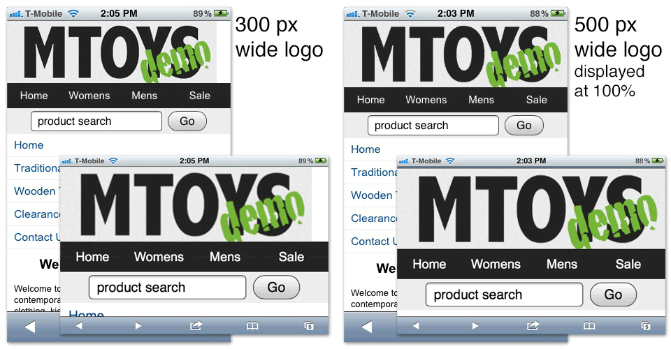
click to view larger image